Hay propiedades muy utilizadas en HTML y CSS como lo son los borders y los backgrounds, desde la incorporación de CSS3 se han mejorado de forma tal que podemos tener bordes redondeados por ejemplo, a pesar que es algo que se ve bastante simple, esto no estuvo disponible en el pasado, por lo que estas funcionalidades ahora facilitan de una manera bastante amplia el trabajo tanto de diseñadores y de desarrolladores.
Al momento de aplicar un borde debemos tener en cuenta 3 atributos muy importantes, estos son:
Para definir el ancho del borde podemos trabajar en base a 3 medidas, por unidades de medida como pixels, cm, em; por porcentajes y por valores preseteados como por ejemplo, thin, médium y thick.
El tipo de borde lo definimos con el estilo, para ello tenemos las siguientes opciones:
Existe la posibilidad también de aplicar un borde y un estilo a cada uno de los lados del elemento, para ello utilizaremos las siguientes instrucciones:
[color=#d3d3d3]border-top-width
border-top-style
border-top-color[/color]
border-bottom-width
border-bottom-style
border-bottom-color
[color=#d3d3d3]border-left-width
border-left-style
border-left-color[/color]
[color=#d3d3d3]border-right-width
border-right-style
border-right-color[/color]
Donde top se refiere a la parte superior, bottom a la inferior, left a la izquierda y right a la derecha.
Con ello inclusive podemos lograr combinaciones de tipos de bordes en un mismo elemento.
Veamos un ejemplo de esto último:
El código nos da como resultado lo siguiente:
Para crear los bordes redondeados podemos utilizar la propiedad radius que nos permite indicar el radio de curvatura del borde.
Veamos cómo implementarlo el código:
Esto nos da como resultado la siguiente pantalla:
Con esto concluimos este tutorial sobre estos elementos, ya podemos incorporar mejoras sobre nuestros CSS sin mucho esfuerzo y con herramientas de vanguardia tecnológica.
Aplicando un borde
Al momento de aplicar un borde debemos tener en cuenta 3 atributos muy importantes, estos son:
- border-width: inicializa el ancho del borde.
- border-style: inicializa el estilo para dibujar el borde.
- border-color: inicializa el color del borde.
<!DOCTYPE HTML>
<html>
		 <head>
					 <title>Example</title>

					 <style type="text/css">
								 p {
											 border-width: 5px;
											 border-style: solid;
											 border-color: black;
								 }
					 </style>
		 </head>
<body>
		 <p>
					 There are lots of different kinds of fruit - there are over 500 varieties
					 of banana alone. By the time we add the countless types of apples, oranges,
					 and other well-known fruit, we are faced with thousands of choices.
		 </p>
</body>
</html>
Para definir el ancho del borde podemos trabajar en base a 3 medidas, por unidades de medida como pixels, cm, em; por porcentajes y por valores preseteados como por ejemplo, thin, médium y thick.
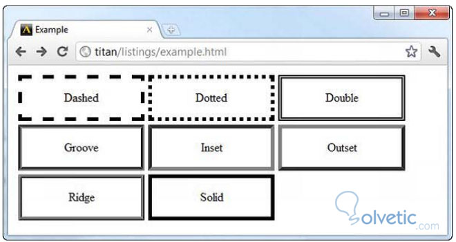
Tipos de borde
El tipo de borde lo definimos con el estilo, para ello tenemos las siguientes opciones:
- none
- dashed
- dotted
- double
- groove
- inset
- outset
- ridge
- solid
Existe la posibilidad también de aplicar un borde y un estilo a cada uno de los lados del elemento, para ello utilizaremos las siguientes instrucciones:
[color=#d3d3d3]border-top-width
border-top-style
border-top-color[/color]
border-bottom-width
border-bottom-style
border-bottom-color
[color=#d3d3d3]border-left-width
border-left-style
border-left-color[/color]
[color=#d3d3d3]border-right-width
border-right-style
border-right-color[/color]
Donde top se refiere a la parte superior, bottom a la inferior, left a la izquierda y right a la derecha.
Con ello inclusive podemos lograr combinaciones de tipos de bordes en un mismo elemento.
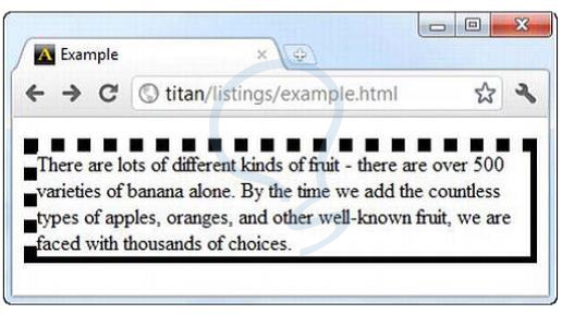
Veamos un ejemplo de esto último:
<!DOCTYPE HTML>
<html>
		 <head>
					 <title>Example</title>
					 <style type="text/css">
								 p {
											 border-width: 5px;
											 border-style: solid;
											 border-color: black;
											 border-left-width: 10px;
											 border-left-style: dotted;
											 border-top-width: 10px;
											 border-top-style: dotted;
								 }
					 </style>
		 </head>
<body>
					 <p>
					 There are lots of different kinds of fruit - there are over 500 varieties
					 of banana alone. By the time we add the countless types of apples, oranges,
					 and other well-known fruit, we are faced with thousands of choices.
					 </p>
</body>
</html>
El código nos da como resultado lo siguiente:
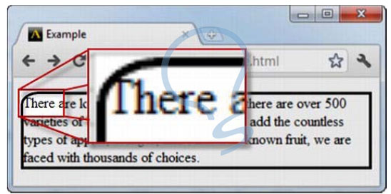
Border Radius
Para crear los bordes redondeados podemos utilizar la propiedad radius que nos permite indicar el radio de curvatura del borde.
Veamos cómo implementarlo el código:
<!DOCTYPE HTML>
<html>
		 <head>
					 <title>Example</title>
					 <style type="text/css">
								 p {
											 border: medium solid black;
											 border-top-left-radius: 20px 15px;
								 }</style>
		 </head>
<body>
					 <p>
								 There are lots of different kinds of fruit - there are over 500 varieties
								 of banana alone. By the time we add the countless types of apples, oranges,
								 and other well-known fruit, we are faced with thousands of choices.
					 </p>
</body>
</html>
Esto nos da como resultado la siguiente pantalla:
Con esto concluimos este tutorial sobre estos elementos, ya podemos incorporar mejoras sobre nuestros CSS sin mucho esfuerzo y con herramientas de vanguardia tecnológica.

